Signs draw attention, communicate a message and compete with the environment around them.
Wayfinding and orientation signage
Good enabling dementia signage can have a significant benefit for people living with dementia, by supporting independence, confidence and wellbeing. Enabling signage:
Is clear, easily visible, with good colour contrast.
Has easily recognised symbols.
Leads people on a pathway to their destination.
Should not be surrounded by other signs and information.
Location
Bright even light around signage is required to show the environment, and sign itself, clearly. Signs should be positioned for people to clearly see and identify, within direct line of sight. Many older people tend to look downwards, and it is recommended signs are lower than normal, centred, 1.4m from floor as shown below.
X Slider Background Settings
X Slider Background Settings
Sign design
The size of the sign and letters will be determined by how far the sign is from the viewer and its placement within the environment. A sign needs to be readable and convey its message clearly, indicating wayfinding, identifying areas, items and places. A sign will be more readable using the following:
Bright primary contrasting colours (see below).
Consider incorporating yellow as it is the last colour on the spectrum that a person loses.
Clear, easily recognisable picture logos.
Simple wording only.
Simple and legible font such as Arial typeface.
Sentence case rather than all capital letters.
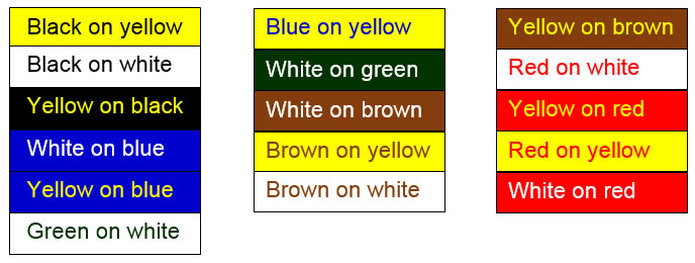
Colour and contrast
Colours and contrast are an important part of signage. Most signs include words and objects that are a different colour than the background. This contrast affects the readability of the sign. It’s important to use a colour contrasting to the environment, on the background of the sign. The letters need to contrast with the background colour. Reference: Visual Communication Though Signage, authors Karen Claus and James Claus ranked the following colour combinations from most to least readable.
Downloads
You can download a range of signage below. Artwork can be reduced or enlarged where needed. Signs should be matte laminated to reduce glare and increase durability.