Colour use and pattern is an important part of dementia enabling design. An inappropriate choice of colour or pattern can make the environment more confusing for a person living with dementia, which can have a negative impact on their independence. Pattern and colour can be present on surfaces such as flooring, fabric or wallpaper.
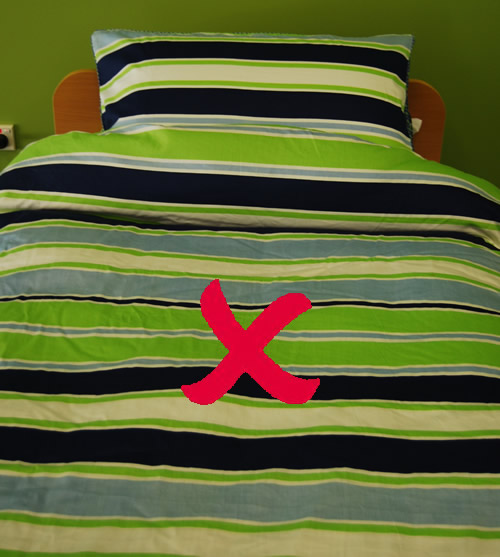
Avoid patterns which are overly bold or prominent because of their large sized motifs or striking colour contrast. Bold patterns such as stripes and zig-zags can be perceived as moving objects. Subtle patterns which are low in contrast are a better choice.
People living with dementia may perceive patterns and motifs as actual objects. For example in a kitchen, a laminate benchtop with a pattern of white specks on a dark background may be perceived as crumbs which the person may attempt to clean or pick up. In this instance, a solid colour surface may be more appropriate.
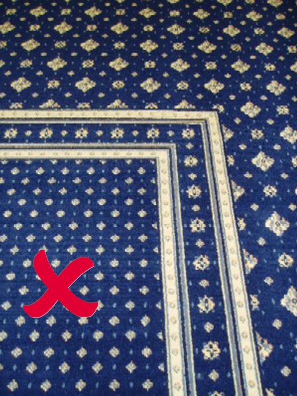
Highly contrasting patterns on the floor (such as a checker-board pattern or wood flooring with an overly prominent grain) may be perceived to be changes in floor level or ‘holes’ in the ground.
Similarly, highly contrasting patterns on vertical surfaces may be perceived to be changes in depth, and so should be avoided.
Referenced from: Calkins, Margaret P. 1988. Design for Dementia - Planning Environments for the Elderly and Confused. Maryland, United States of America: National Health Publishing.
X Slider Background Settings
Dementia Specialist Consultancy Services
Alzheimer's WA's capacity building model brings our dementia expertise to support the development of your services and environments.